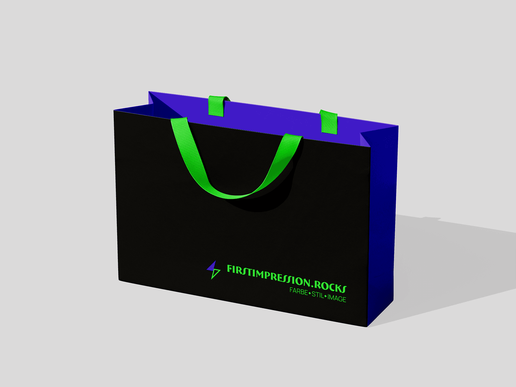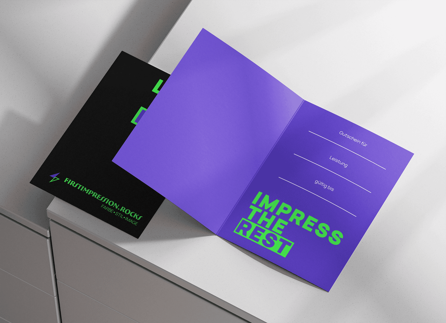
It’s a brand that specializes in color analysis and makeup in Germany.
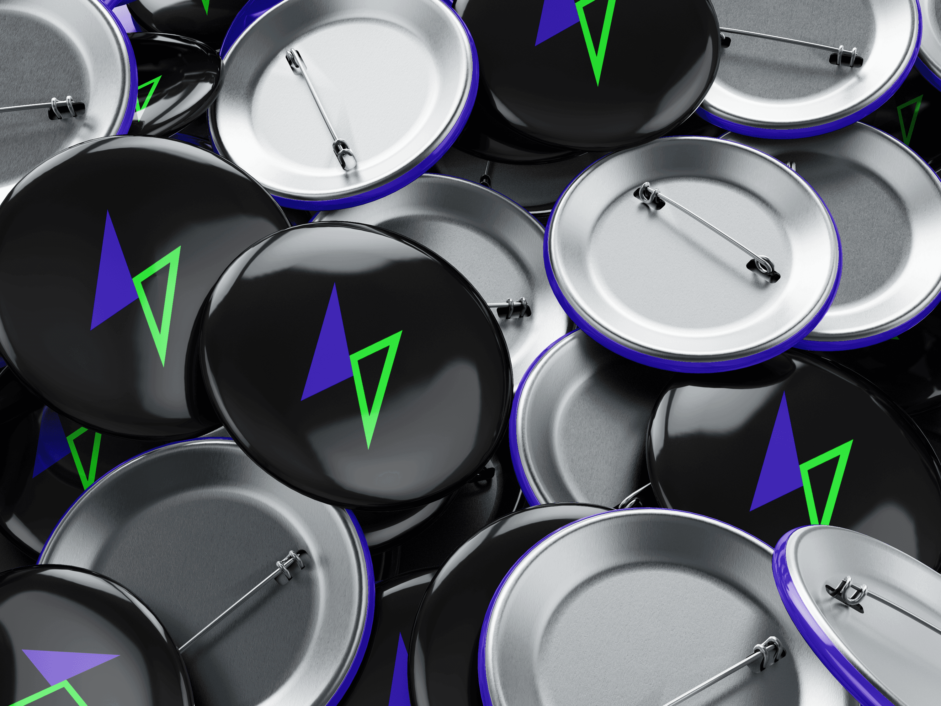
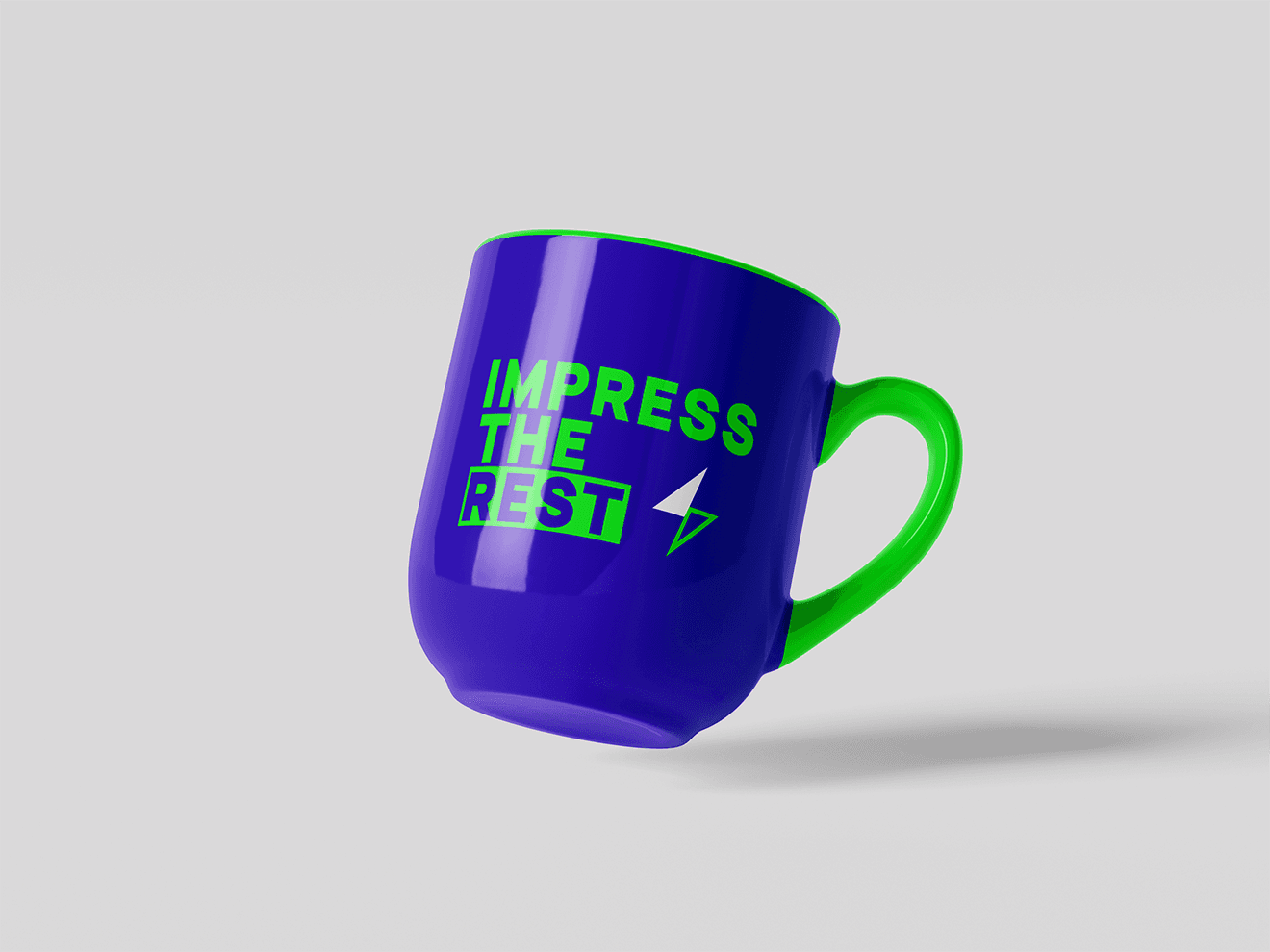
The symbol mark represents a lightning bolt, symbolizing quick transformation and dynamic change. The contrast between the filled and outlined halves of the symbol creates a sense of balance and energy, reflecting the brand’s focus on discovering harmony through color.
This duality also mirrors the essence of color analysis — the balance between light and shadow, warm and cool tones — showing how subtle differences can completely transform one’s appearance and confidence.